Just a quick note.. about the theme. One thing that I would like to know about the new theme is to what extent we can customize the way it looks. For example.. Adding our logo to the top of the page, changing the colour of the navigation bar / hover over buttons on it and the font/ colours of the pages content.
I guess this must be a feature of the premium version, but I would just like to know if this can be done and to what extent.
Wasn’t ignoring this post. Just wanted to make sure I check some things before I replied.
It is possible to change the font. The font on the demo is Arial, which I believe is the same font that the front page uses…as well as the majority of the entire internet.
You mentioned that on the current site, some pages use Trebuchet MS while others use another font. Personally, that is annoying. We used Trebuchet MS on the first design (1.0) which I am to blame. At first, I liked Trebuchet, but as time went on, I realized that it wasn’t the right choice for a website that is being accessed around the world. The reason why Arial or Helvetica is the commonly used font on the web is because all the browsers can read it.
Anyhow, I don’t plan on using Trebuchet for the new design and I’d like it to be a site-wide thing. It looks weird having the Toy and Cartoon section have different fonts…at least IMO.
I was pondering this earlier, and whilst all the WordPress pages I’ve seen have been fantastic in the sense that they are really clearly laid out, I think part of the thing with them for me is that they remind me of some of the early desktop publishing programmes I used to use when I was a kid for the RISC OS operating system, whereby they were clearly laid out but you were limited by the rather sterile-looking template that they gave you, ditto in some cases you had a very small number of fonts and such to choose from. I think a lot of this site’s appeal is in the design and layout that it has now (and, I will say, the design it had originally, which was a lot better than you thought it was my friend!), when speaking to folks like original comic art collectors I get a great deal of compliments about the look and design of the site. Now, I’m not saying I think that the site as it is has reached the pinacle of how good it can look, but what I am saying is that from a purely visual perspective I’m reluctant to see us fixing what isn’t broken.
I really don’t see it as sterile layouts though. As much as I like our current design, it definitely is not perfect. It’s faaar from perfect. I could list tons of things that are wrong with it, both from a design standpoint and a technical standpoint. And that’s not saying that with a new layout that the site will be perfect…because nothing is perfect. That said, there is so much more we could do to improve the site. In order to stay relevant in the ever-changing world we call the internet, we have to continue to change as well. Three years ago when we first started this site, CSS had just started to become the standard. Now, we have sites that are entirely-Flash and use very little HTML.
With so many new programming codes like Ajax and RSS feeds, it’s really easy to be lost in translation (pun intended).
I really dislike using He-Man.org as a comparison because I want our own identity, but the reason why they haven’t updated the main site in years is because they can’t. The coding they used is so old and hard to update that they have to spend thousands of dollars to redo the site from scratch. I feel like I’ve said this before in one of my previous posts, but I’d like to avoid that with this site.
I think some of my reluctance is because I have no idea how customisable the WordPress design is - i.e., whether you can literally make a site created using WordPress look absolutely any way you want it to. Whilst I’m not suggesting that this should happen, theoretically if you wanted to, could the current template of this site (so, the logo, the nav bar, the white space with the red bars at that width, with the page header, footer, fonts, etc.) be replicated in exact detail, or does WordPress have limitations? If you were to turn round to me and say “The only limitation of this is the limitation of your imagination!”, that would ease my mind a lot! I definitely have a monumental amount of faith in your eye for graphic design, the proof of that pudding rests with the very site design I’m too anal retentive to let go of - however, like I say, I would hate to sacrifice the sheer beauty of this site unless it was to replace it with something that looked even better.
From a visual standpoint, Wordpress looks like any other site. However, the best thing about the software is that it is fully customizable. Perhaps your reluctance is in the limitations you see in the interface…but Wordpress is far from limited.
If I said the only limitation is my imagination, I would be lying because even HTML can’t product what’s in my imagination. May be Flash, but then you’d have to ask Kyle the limitations of that is.
We’ve known each other for about three years Chris, and in that timespan, you as well as the rest of the site should know by now that I would not sacrifice the design and layout for simplicity. I want simplicity in interfacing with the website, not simplicity in design and layout…although if you remember back when I first created the first design…I touted “simple, yet effective design” will be what separates us from the other ThunderCats websites…and that still holds true today.
I realise I’m very much the only real “naysayer” of this, and to be honest I feel very badly about it - you’ve worked bloody hard on this site, MannyF, in fact heck, without you, there would be no site, and as such, in some ways I feel as though I should just be quiet and accept whatever you, as Site Leader, believe is in the best interests of the site. I’m immensely proud that you guys allow me to be part of this team and please know that whatever I say on this subject, what I want is the best for this site. Whilst I am someone who dislikes change, I’m also a very pragmatic person and so am always happy to look at these things with an open mind. I’m extremely grateful to you, my friend, for taking the time to listen to my concerns!
Believe me, I dislike change as well. However, I really want more than anything else is for this site to keep growing in every aspect. I want this site, come 2009-10 to be the most relevant ThunderCats site on the web, not just from a visual perspective, but from a technical advantage as well.
I know from experience that timing is everything – I’ve been trying to plan the timing of all of these changes so that it benefits the site in the long-run.
When did He-Man.org start gaining momentum? With the release of the commemorative re-issues of the old toyline.
What did He-Man.org hit its peak? When Mattel announced a new cartoon/toyline for MOTU.
I’m preparing this site the same way. When will ThunderCats Lair start gaining momentum? When will we hit our peak? At this point, we don’t have specifics, but if I start planning now, I can make our site THE place to get all of that information when it does hit.
In other words, all I want to do is see the site become successful and have all our hardwork become more noticeable than ever before.
Oh, and BTW - I agree with MannyC, that way of displaying the screenshots is absolutely AWESOME! Is there a way from loading a screenshot that you can navigate forward or backward in the way that the production material in Mark’s Animation Art section does? To be completely honest, Kyle & I had alternative plans for displaying the way screenshots open in the current Episode Guide template but never got round to researching the coding needed to implement it - if the new technology would allow them to be displayed like that, the thought of correcting that would certainly warm me up to the concept!
Quick mention since my post is super long! The one in the demo doesn’t navigate back and forth. However, I can implement what Mark is currently using on the Animation Art section very easily (with Wordpress). Mark gave me the code awhile back, but I just didn’t have the time (or patience) to implement it. With WP, anyone can use it.
Alrighty…last thing. While I definitely understand Chris’ and Kyle’s concerns on the upgrade…I would like to move forward with this project. I’ll be working on this behind the scenes and asking for suggestions and opinions once in awhile. I’m planning on purchasing the license this weekend and I will start experimenting with it for the next couple of weeks and get used to the coding and scripting.
Okay, I’m done!
It’s all customizable. I just didn’t bother doing it on the demo because it’s a demo. All the things you mentioned are customizable in WP. There is only one version of WP and it’s free.
On the font issue, fair enough about the web browsers issue. I have to be honest and say, I’m not sold on Arial as a font - you mention that 90% of webpages use it, to be honest that’s more than likely why I don’t like it! It works on something like a front page layout, but IMO for internal webpages, put together as much for their eye-catching value as functionality, it can look kind of dull. That said, the website I put together, www.willowsfolkclub.org, is based predominantly around Arial (simply because it’s been a font associated with my club’s identity, as it were, going back to printed material from the early 1990s), so I know it can work.
In terms of different fonts being used for different areas of the site - I agree that the site should use one font. I must confess I wasn’t aware that some areas of the site used different fonts from another (apart from the front page) - I thought the Toy Section as it stands used Trebuchet throughout…? :?
That’s fair enough, and the He-Man.Org analogy is fair enough too - future-proofing the site is a hard thing to do with previous designs, and so I certainly understand where you’re coming from. I certainly don’t want to see the site get lost in the mix either.
Well, maybe “the limit of your imagination” was a bit strong, LOL! Hopefully you got/get what I mean though, which I think you did because you addressed it very effectively - how I take what you’re basically saying is that a site created in WordPress can, theoretically, be made to look however you like, subject to the same limitations (or at least, no greater limitations) than standard HTML. If that’s the case, then that’s good enough as far as I’m concerned.
Cool, and that all sounds fair enough - I agree about capitalising on what’s happening in the world of ThunderCats. And, I did in fact wonder whether, with the impending release of the TCats movie, we would have to alter the site design to accommodate an altered “brand recognition” - which is a very clumsy way of saying, like He-Man.Org changed the appearance of their site in around 2002/3 to reflect the new toyline, cartoon, comics, etc., I wondered if we may need to do the same.
(As a complete side note, based on their forums it looks as though He-Man.Org are going for a “retro” look - whatever JVS3 and Emiliano may say to the contrary, I’m 100% convinced that that ties in with Mattel’s forthcoming plans re: another MOTU toyline! ;))
Cool stuff, that would be one hell of a way to display those, and would rectify what Kyle & I were never able to implement with regard to displaying the screenshots.
That’s cool - you’ve eased a lot of my concerns, pretty much the only issue where I have a problem is with the font thing, but that’s pretty minor in the grand scheme. Looking forward to seeing the results of your hard work, and thanks again for taking the time to address my concerns.
I’m glad I’ve helped ease your concerns at least a little bit. I definitely think you’ll like what I have in store for the site…and hopefully, I can give everyone a better concept of what I’m aiming for in the next month or so.
Working to show everyone a close representation of what I expect the site to look like. I actually think I could show you guys what/how things are going to look visually on a general level, but I’m going to hold off for a little bit longer.
I know it’s not much, but just wanted to let you guys know I’m progressing a lot quicker than I expected!
I seriously haven’t felt this excited since 2005 when we were just talking about the site!! 8)
Well, I have something up and running, but I’m still not comfortable showing it off. I do have screenshots of what it looks like.
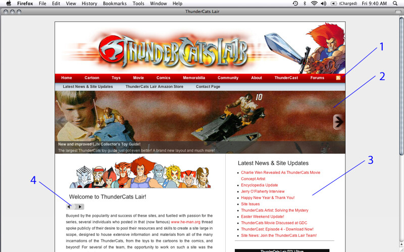
1st Screenshot (Corresponding Numbers):
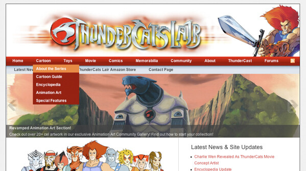
The navigation bar is easily changeable. I can add any section without having to modify any pages.
This will display key site updates and news. It rotates every 5 seconds.
All the latest updates will be posted here. It’s all automatic. I write a post…it gets published on both the news page and the title shows up on the front page.
Flash MP3 Player. This one plays Lion-O’s TCL intro. We can use it the flash player throughout the site.
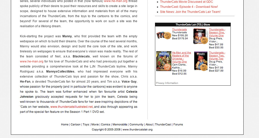
2nd Screenshot:
Right Side - Advertisements. We can advertise Google, TCL Store, or something else. The front page will be more like a splash page and intro to the site.
Footer - Since we might have some long pages, it’s helpful to have a footer that has links to all the main sections. It’s a small addition, but I definitely think it will be helpful.
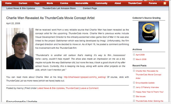
3rd Screenshot:
This will be the actual news/updates page. The changes are small, but will help in organization. We can organize posts by section updates, general updates, dvd news, movie news, etc. Once I get the RSS Feed up, it will provide another method for visitors to get site updates/news quicker than ever.
Also, I’ve also enabled comments. I’d like to integrate the comments into the forums, so that’s also on my “to-do” list.
Right side shows ads or whatever else we want there. The recent posts also keeps all updates fresh without having to scroll and scroll…and scroll. Archives are also implemented automatically.
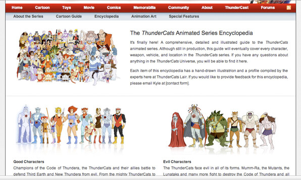
4th Screenshot:
Just as a visual, this is what a main section page could look like. It’s an early look at how it might be laid out.
5th Screenshot:
Basically just shows the drop-down menu addition. Also, the subnav bar is also easily customizable.
Just wanted to show that I do have something to show and it is working, but not ready to show everything at the moment. As you can, it has some cool stuff, but by and large, we still have the same overall feel of the site. Making it more efficient to navigate, organize, and update is the main priority.
You have a convert here, Manny - those look fantastic, and as Kyle correct states, the nav bar looks great!
If I had one constructive criticism, I really, really miss the red area around the body of each page (I’ve just described it really horribly through tiredness, but I’m sure you know what I mean - basically the red “border” around each white page containing the content) - for me, visually, that red border is amazing for focussing the eye of the person visiting the site onto the content on the white area and really adds something. I know I sound like I’m wedded to the past - largely that’s because I really think this site visually is nigh on perfect already - but honestly (and bear in mind this is coming from the single biggest “nay sayer” on the upgrade), I think those screenshots you’ve posted up look absolutely amazing! So, I hope you don’t mind my constructive comment - keep up the awesome work, Manny my friend!
One other comment that I know will ruffle a few feathers but might as well mention it now - I’m also not really keen on giving Celesta’s website, www.thundercatsillustrated.net, a permanent plug on the new front page given that she’s systematically gone through her site and removed every single conceivable link to ours - I know she’s a friend of yours Manny, but fair’s fair IMO - if she’s prepared to link to our site then I’m happy for us to link to hers, and I’m always happy to link to her site when using any images that she’s donated, etc., but I think giving her site a permanent front page plug when she’s not prepared to do the same is a bit of a mug’s game. She also in the team founder member bio seems to get the biggest mention of anybody! Anyway, no big deal, but just my $0.02 FWIW.
Like I say, keep up the amazing work, Manny my friend - you have a convert here!!
I’m glad you guys are open to the design and layout. It’s still way too early, but once the foundation is done, I think everything else will go a lot smoother.
It’s beautiful - that’s a gorgeous colour red! I actually quite like the new button too (the one that says “Episode Synopsis”), I like how it blends into the white background that it’s placed over!
I also like how you’ve rounded off the corners of the title card image, which is very stylish looking! I could imagine it being a pain to edit each title card screenshot in a PhotoShop-type programme to achieve that effect for each page, but if it can be pulled off I think that’s a superb effect!
My one question is, I’m assuming that the episode synopsis for each page will still have a graphic to illustrate it, like we have one to the left of each synopsis now? I’m guessing that’s the case and this is just a “work in progress”, but thought I’d check…
Yeah the new button is actually the graphic that Kyle used for your forum signature…so kudos to Kyle for that!
The rounded corners isn’t a problem actually. I can batch all the title cards at once to have that effect. Gathering all the title cards will probably take more time than the actual batching process, but it should be worth it. It does look nice.
As for the synopsis graphic…yeah I was thinking about leaving it out unless you don’t mind me resizing it to be smaller? I can tinker around with it more. When I finalized a template, I’ll send a PM to the section manager(s) and get feedback. So yeah, work-in-progress as usual.
The only problem I’ve encountered with the episode guide is the quote bubbles. I sent Kyle a PM about it already…hopefully, I can get it to work, otherwise I’ll have to take a different approach to it. The bubble will stay, it might just be a little more work to implement it.
I’ll keep everyone updated on it.
EDIT: By the way Chris…could you test something for me? In FireFox, when I click on Leonard Starr’s name in the episode guide, it doesn’t go directly to his profile in the article. However, when I use IE7…it works perfectly. I just wanted to know if it’s just on my side or if it’s happening for others as well.
Apologies for the delayed response - I must have missed this reply!
Awesome news!
Yeah, I’d like to keep the synopsis images if possible, just because I’ve put a lot of work into selecting the right ones, etc. - I think the page could look a little plain without…
Any particular reason why that would need resizing? Not that I’ve a problem with so doing if it looks better, but just wondered why it would need to be smaller to fit with the new design…?
And yep, I would really, really, really like to keep the speech bubbles and the way of displaying the quotes with Kyle’s artwork - it’s such an easy way (for me) of displaying the quotes, plus any excuse to use Kyle’s awesome artwork!
Well, I’m using IE6 (I think!) and it works OK for me - I just used the basic HTML tags for making a link jump to a specific point on a page, both on the “About the Writers” page and then for the code in the Episode Guide pages themselves!
Interesting revelation…He-Man.org’s new look resembles a Wiki-type layout and system. I was expecting something different. Then again, I think it’s better for them to do an open-type content system since they have a large community. The CMS must have cost a pretty penny. What do you guys think of their redesign?
Looks ok but you cant say until you play around with it. How much do you think cost them to redesign the site. If all proceeds did in fact go towards the redesign then my best guess is around $10K
 Just wanted to make sure I check some things before I replied.

 I sent Kyle a PM about it already…hopefully, I can get it to work, otherwise I’ll have to take a different approach to it. The bubble will stay, it might just be a little more work to implement it.
